Introducing Forged in the Dark Mechanics with a Comic Book

Hey all,

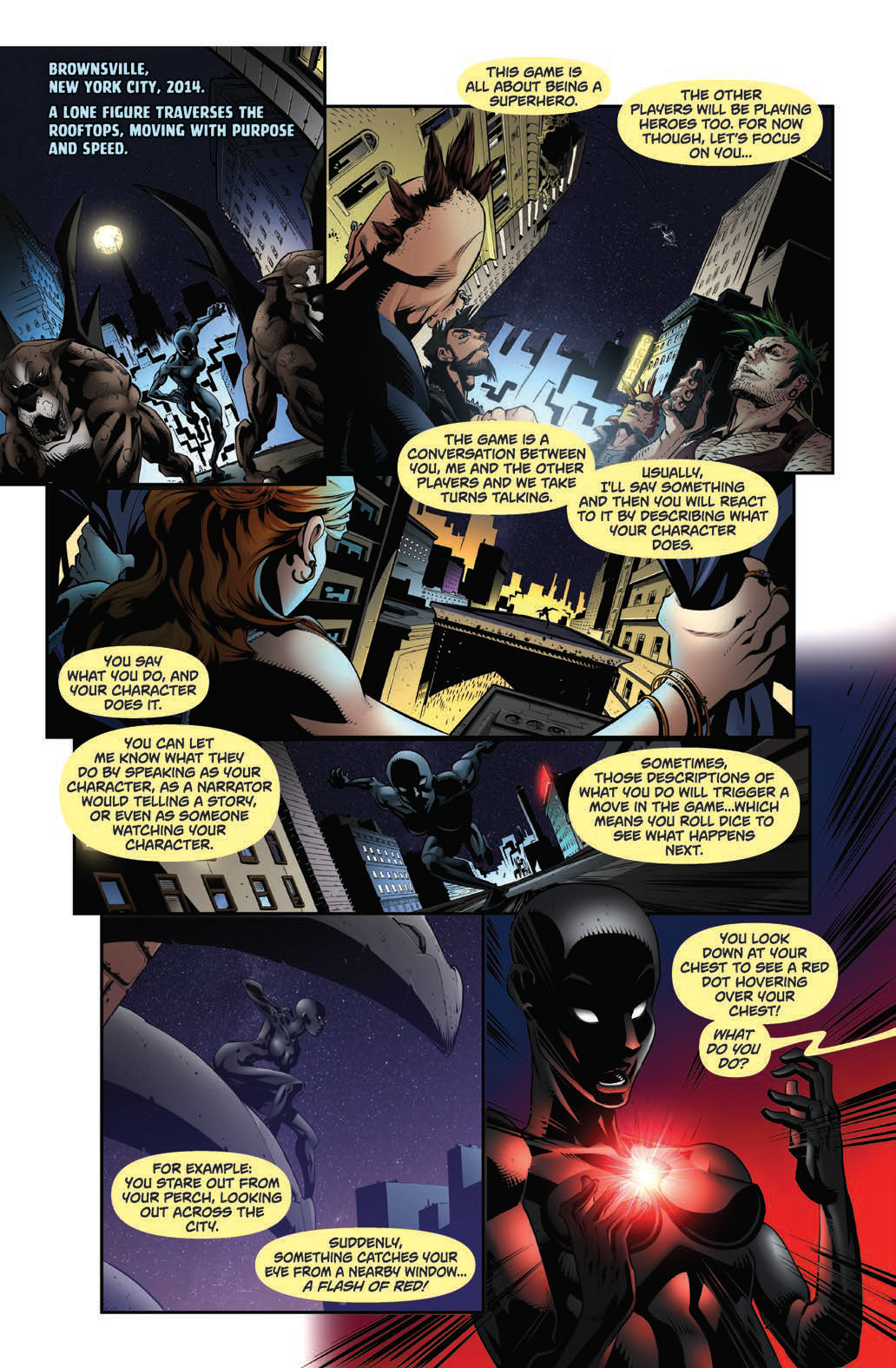
So the kickstarter for Galaxies in Peril is doing very well, which means I have the awesomely fun responsibility of putting together an outline for the introductory comic that looks like will be going in it.

It can’t be entirely comprehensive of course, but I would appreciate any feedback on things you’d like to see in there, or see clarified, or don’t like, etc.

I’ve linked the word file below, I’d appreciate any eyeballs on it. I’ve tried to make it a bit lighter, more action-packed, and less dialogue-heavy than the Worlds in Peril comic if you’re familiar with it. Ideally, I’d like to keep it in the page range I’ve got since it can get both a bit pricey and takes a big time commitment to get done.

Here’s the word file thanks in advance!

Do they have to talk crunch like this all the time ? It’s like there is very little narration going on, and I think it mostly teaches an habit of cutting to crunch as soon as possible. If you really want to conversationalize, you could have an exterior narrator explain stuff ?

The comic is meant to teach the mechanics of the game.

Surely you don’t mean that players talking dice and stats way more than narrating or speaking in character is a mechanic of the game ?

If I was new to a Forged in the Dark game and sat down to play with my friends, they’d have to explain the mechanics of the game to me. They’d have to explain character creation, and the core mechanics of the game, right?

The comic isn’t just introducing the idea of what it is to roleplay a character, it’s introducing Forged in the Dark mechanics, and, like I said, every additional page is more money.

2 Likes

I see : you don’t want explanations on the side that would eat up too much space. I respect your choice of comments eating up whatever narration and dialogues players would have done instead. I find it peculiar but it’s your thing and I’ll just bow out.
That put to the side, explaining via a comic book is a very good idea and perfectly fitting with the content and tone.

2 Likes

Thanks, it’s just that, at least in my mind, pretty much the only thing I can rely on the reader knowing is how to roleplay and there are so many forged in the dark mechanics to walk through that I have to make some hard choices about what to include.

For example, I don’t go over the end of the score/mission cycle, talk about XP or base mechanics, the maps & stickers at all or include resistance mechanics and it’s still already at 15 pages!

1 Like

Teaching how to play an RPG is probably the hardest design challenge.
I remember WiP doing an excellent job explaining with a comic what roleplaying in general is.
If the job is to teach the core mechanics, I find that your text is doing a good job.

As a source of inspiration, I find Psi*Run a good example. The booklet uses example dialogues in a simple fashion to explain the game mechanics.
Of course, the best game design ever in explaining the mechanics is For the Queen. It effortlessly teaches you how to play and before you notice, you are already playing…

1 Like

Yeah, I’m watching some actual plays with John Harper to see if I can get some more concise inspiration maybe. I just got a copy of For the Queen so I’ll check that out, too!

I may prune the downtime stuff to focus on the core mechanic and allow it to be a little more organic like WiP. Tough choices.

1 Like

Actually made a second attempt at this in case anyone is interested!

Here’s the file for the second attempt.

err. : page count 9 & 12

1 Like

Comic artist, editor and game designer here. Sorry, couldn’t help but cringe when I read “black guy, asian guy” in the first version. Good call to change that in the second one. Artists may be sensitive and see you in a different light, though paid artists care less about this tbh.

Looks ok, though I see no indication how you plan to handle the scenes where the DM and players talk but all we see are the things happening in the fiction. Text boxes of different color or just stating the name of whoever is talking at the beggining? Inserts of character’s heads over the panel? If you’re not the artist you may want to explain some of this somewhere.

You may want to consider dividing the page in two columns whenever you need to explain mechanics and make panels from one side show what is happening at the table (dice rolls, character sheets and player’s reactions) while the panels on the other side of the page show what happens in the fictional world. A good artist will know how to make both sides equally exciting to see. Like this but better:

3 Likes

Huh yeah, that would be interesting.

What we did last time with the comic for Worlds in Peril comic came out like this, which still worked, but definitely a lot more subtle. That idea about the two columns is pretty cool, though. I’m with the same artist on this one so I’m not too worried about notes for the artist.

2 Likes

Yeah, exactly! Try and go for something in between. I’ve also seen Tenra Bansho Zero use simple diagrams or flowcharts to explain some of the mechanics, that may save some space/art

1 Like